CLIENT
Orange County Hotel
Orange County Hotel needed a brand new identity and website that combined the sunny, warm and inviting vibes that southern California is so well-known for to launch their hotel.

Visual Identity Explorations
The first stage of the branding process was to pinpoint the most crucial aspects of who Orange County Hotel is through a ’tissue paper’ session that divided the creative concepts into three buckets.
We focused on ideas around So-Cal vibes, ease and accessibility, and authenticity. With each exploration, we played around with double or triple meanings in the logos, playful versus bold wordmarks, and both deep and light color palettes.


Finalized Identity
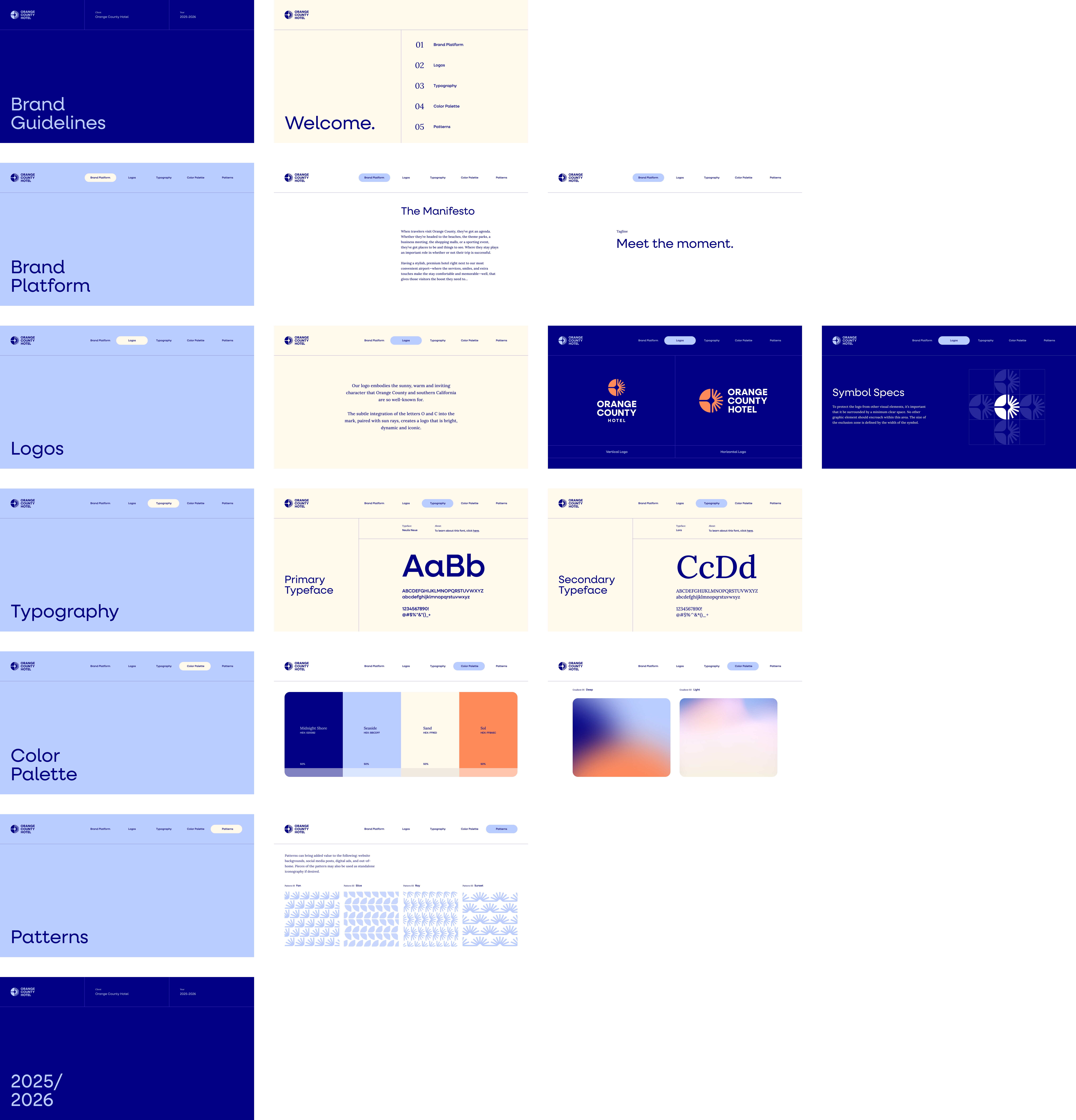
For the logo lockup, the subtle integration of the letters O and C into the finalized mark, paired with sun rays, created a logo that is bright, dynamic and iconic. The wordmark combined a strong and standardized typeface that also includes a bit of a smile. We kept the palette light and airy, reminiscent of a sunset off the southern California coast.
With their identity fully fleshed out, we provided a fully kitted brand guideline deck that included their manifesto and tagline, logo usage, typography, color palette, patterns and iconography.


Branding Templates
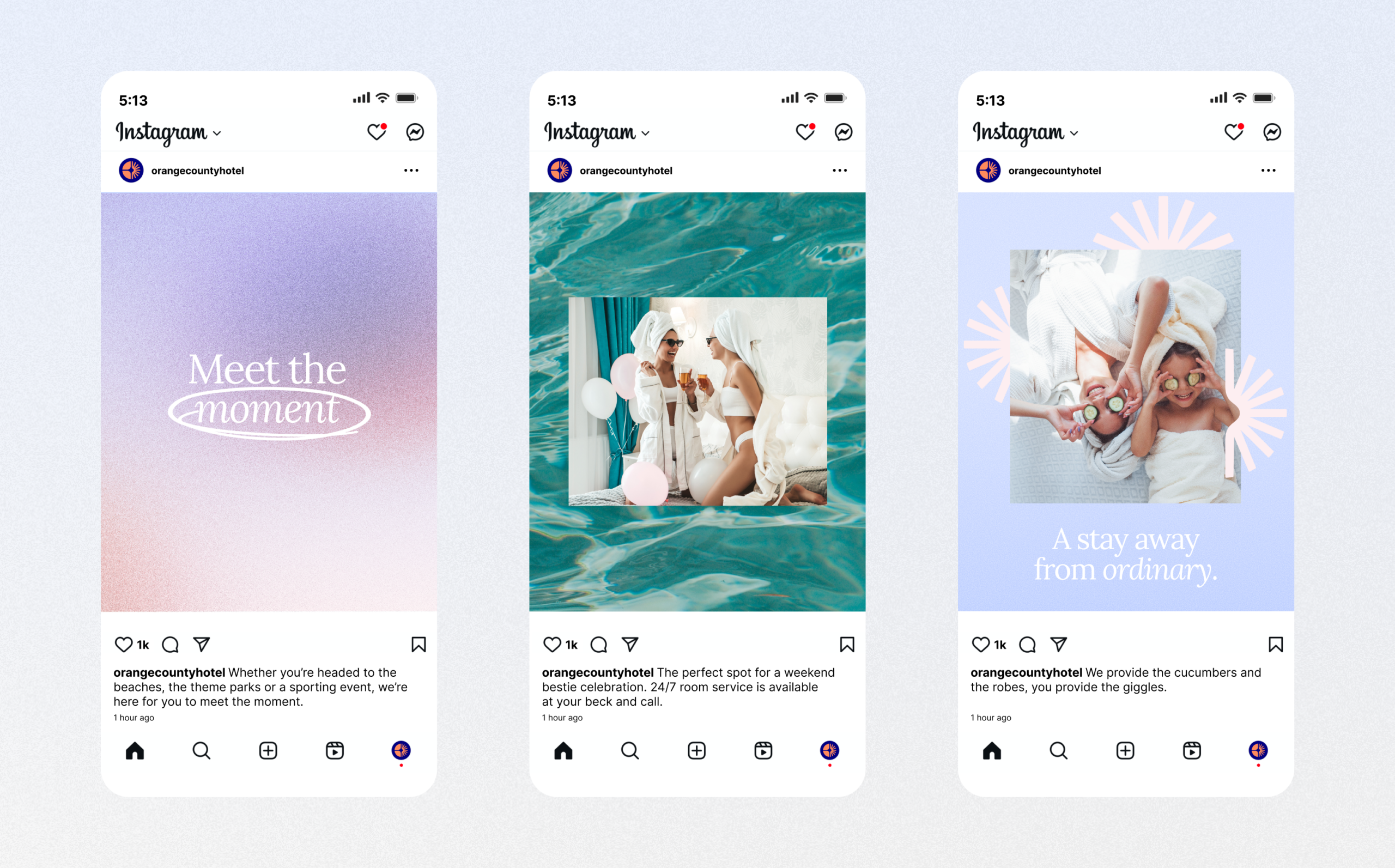
We created some social templates as well as some templates for branded merchandise.


A New Web Experience
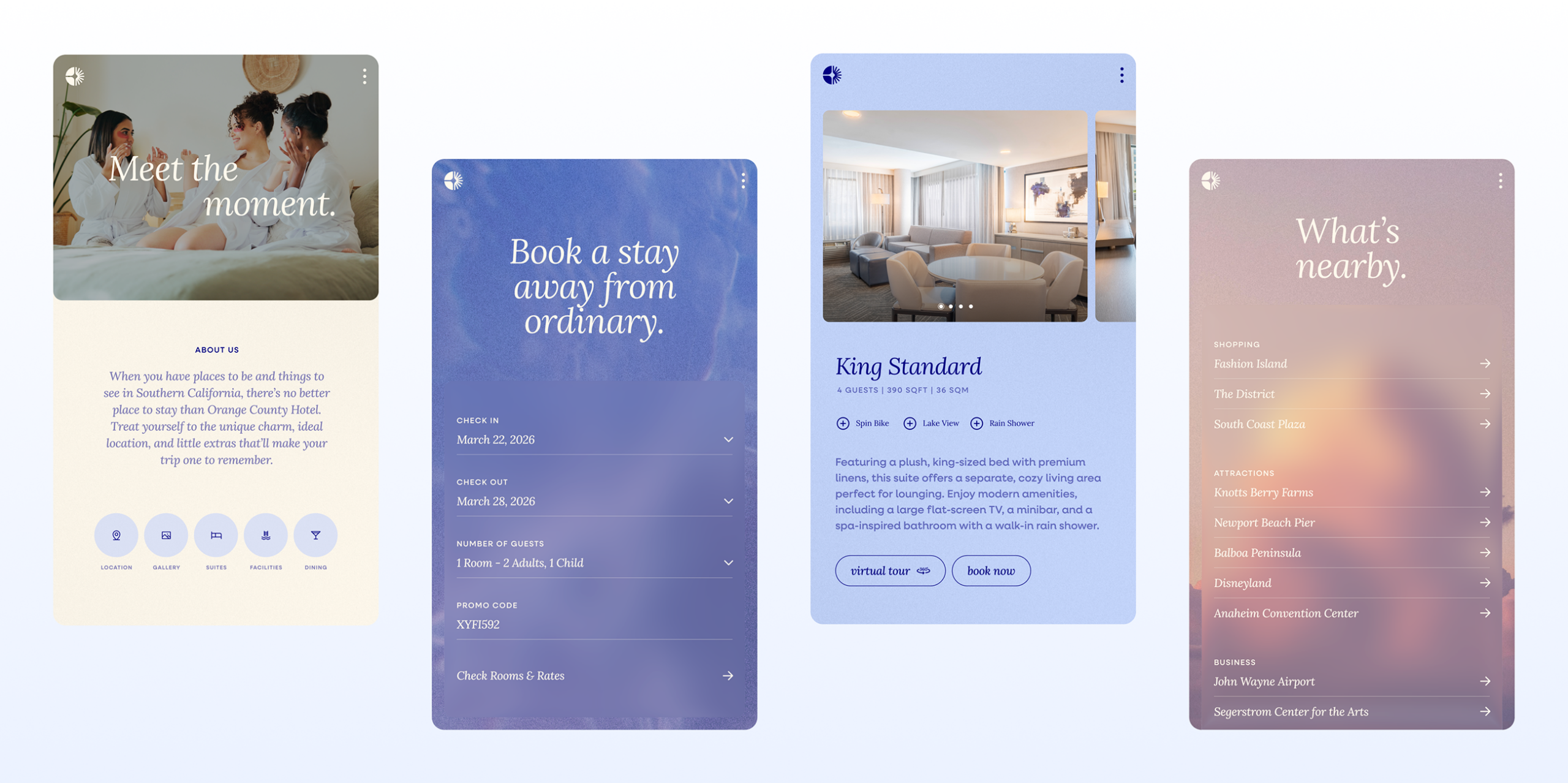
Orange County Hotel also needed a website that could grow with them as they continually added to their identity. Knowing professional photography was going to be an ongoing effort, we focused on key visuals where needed, then filled out the site with textures and subtle imagery that was quintessentially southern California. A mobile first, super friendly design enabled the hotel to start booking guests quickly and efficiently.


