

Visual Identity Explorations The first stage of the branding process was to pinpoint the most crucial aspects of who Orange County Hotel is through a ’tissue paper’ session that divided the creative concepts into three buckets. We focused on ideas around So-Cal vibes, ease and accessibility, and authenticity. With each exploration, we played around with …
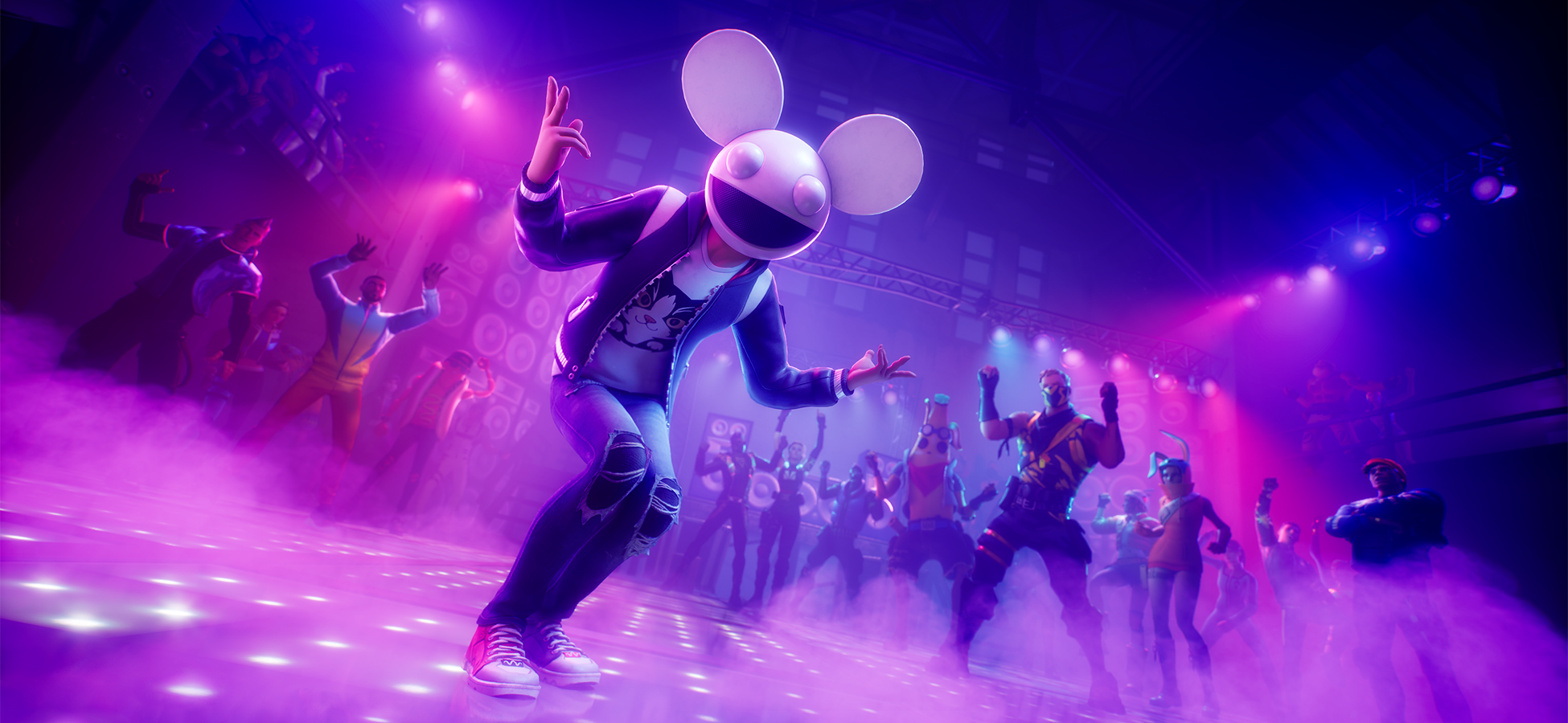
Seasonal Updates To help promote Fortnite’s always-on seasonal content, we have rolled out thousands of trailers, cut-downs, cinemagraphs, html and static banners, digital out of home experiences and console storefronts. Most of which also include localization for over 15 global markets. Two Brands at Play Fortnite is no stranger to collaborating with other brands, and …
Campaign Identity We produced a tagline that was simple, direct, and authoritative. Something that implied leadership without arrogance. The Fuel Teams Trust delivered on those key points. To anchor the campaign, we chose a typeface that is clean, neutral and aesthetically pleasing; Inter would compliment the facts and figures that would be the main star of every …
![]()
Member of Worldwide Partners Inc.
For all general, press related & careers enquiries, info@fivebyfiveglobal.com